During the time of this writing, Oshi Health was a patient-management mobile application and was launched to the public in early 2018. The MVP was originally designed by BCG Digital Ventures. When our team was hired to take on this product full time, we faced pressures to optimize engagement, user retention, and scaling the products to hit business milestones.
While our team was tackling many problems and design projects, I was tasked the project of leading the design for the symptom and disease tracker. The goal was simple–I had to introduce a tracking experience that embodied what our users needed, was smart, and seamlessly tackled the typical hurdles and restrictions of designing for a health technology feature.
The Process
My role was to lead the product design from research through to implementation. I handled everything from user research, managing timelines and sprints, driving the design thinking and visuals to working closely with our development team to hit our tight deadlines.

Discovery
I kicked off the project started with a 2 week sprint dedicated to research and discovery. I partnered with our clinical research lead to further understand why and how to apply clinical thinking to our product. Our goal was to eventually get to a place where we would be able to collect enough data on a user to make predictions around flares. But because what we were collecting were essentially subjective responses on how someone feels, we needed to ensure we tied our data points to clinically validated questions and answer values. Otherwise, our data would not hold any weight in the real clinical world.
I also conducted a series of user research with our existing user base to better understand how real patients manage their diseases. It is not a new fact that patients suffering from GI diseases track their lifestyle, diet, and symptoms to either uncover patterns or keep a log to share with their providers. I needed to further uncover their habits, current experience with tracking, competitive space, user value. In one sprint, I was able to conduct:
Needs
Track symptoms and lifestyle behaviors in one application
Remember key events to report to their provider during appointments
Comprehensive yet simple, patients don’t want to feel overwhelmed
Wants
Caters to multiple GI conditions (patients who suffer from co-morbidities)
Non-restrictive capabilities
Easy to use, not tedious
Business Reqs
Collect data in a user friendly way while balancing clinical requirements
Motivate users to engage with feature consistently

Rapid Prototyping For Testing
Throughout the project, I collected user feedback in the form of concept testing and usability testing with high fidelity mockups. The purpose of these sessions were mainly to gather user feedback on independent concepts or to A/B test different concepts to determine the best experience with minimal risk of failing to accomplish key tasks. As always, I continuously kept stakeholders engaged by leading feedback sessions to ensure that we were all aligned on the direction that I was heading.

A design that can do the work for you.
From the research, we realized patients can find themselves de-prioritizing tracking during a number of use cases. When their disease was in control, patients didn’t see the need to track symptoms and other lifestyle habits. I wanted patients to enjoy their day and forget about their disease when they were feeling good. When their disease activity was elevated, users were sometimes too sick to engage with their phones. I didn’t want to overwhelm users with notification alerts to remind them further of their disease during these times. From a business perspective, however, I needed to encourage consistent tracking.
To balance user needs and feelings with business requirements, I created an experience that integrated connected devices. We partnered with Validic to integrate wearables and import external data to decrease user effort and respect boundaries.
Instead of banking on patients to track their data consistently, we can now relieve them of added effort by allowing them to connect any wearables or other tracking devices to the app. They have the option to edit any imported data and customize the responses however, we do not have to wait for users to enter the app for us to get access to critical information.

Give Users What They Want
During a focus group session I led with current users, I conducted an exercise that allowed users’ to categorize factors relevant to their disease from most important to least. I wanted to understand how users rated some of the factors that impacted their diseases based on their past experience. I used the outcomes to help create the structure and visual hierarchy of the tracker.
It was unsurprising, for example, that all participants felt bowel movements was one of the most important category of symptoms relevant to their disease. It was surprising however, that patients felt Diet & Nutrition were further down the spectrum when it is clinically considered one of the biggest potential symptom triggers.

Don’t Compromise Data Credibility
I had to work closely with the clinical team to ensure that the design and solution met clinical and business requirements. While my goal was to create a delightful and seamless user experience, I had to ensure that the data we were collecting were clinically validated. What this meant was that as a business, our goal was to ensure that our data held weight in the real world. If our user presented the data they tracked in our app to their doctor, the doctor would be able to use it to make recommendations or draw clinical conclusions.
I did a lot of research to ensure that the answers that were being used, down to the way it was being portrayed, followed clinical guidelines. I also suggested that we incorporate specific diagnostic medical tools for us to further solidify the credibility of our data.
From a business perspective, we were ensuring our positioning in the market as an evidence backed service. From a users’ perspective, we were creating easy to use trackers and surveys to help them gain control of their disease.
Post Release Impact
We sent out a brief user satisfaction survey post-release. We learned a lot from the responses–while there were some original feedback, a lot of it was validation for some of our initial hypothesis. For example,
Users recognized that Oshi was listening to their needs when they saw the new bowel movement tracker and journal feature.
At the point of writing this case study, it’s been 5 months post launch. As the tracker was a new feature release, engagement was the main measure of success. Some positive reactions that we saw were,
Steady increase in app usage time
Active users were entering an average of 7 bowel movement entries a week
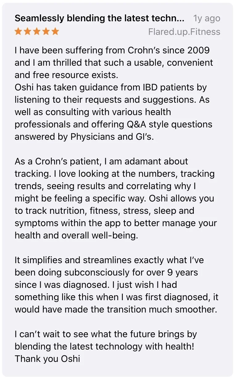
Positive Sentiment in app store reviews
The questionnaire with the least engagement were the clinically validated surveys that had a bi-weely schedule to replicate the scenario of a real clinical office. I imagine this is due to two factors–one being the length of the survey and the other being the absence of a comprehensive notification system for the trackers. We are currently working on mapping out an advanced notification logic tree. I’m hoping we will be able to naturally draw a conclusion once we see the impact that notifications will have on our user’s activity.